
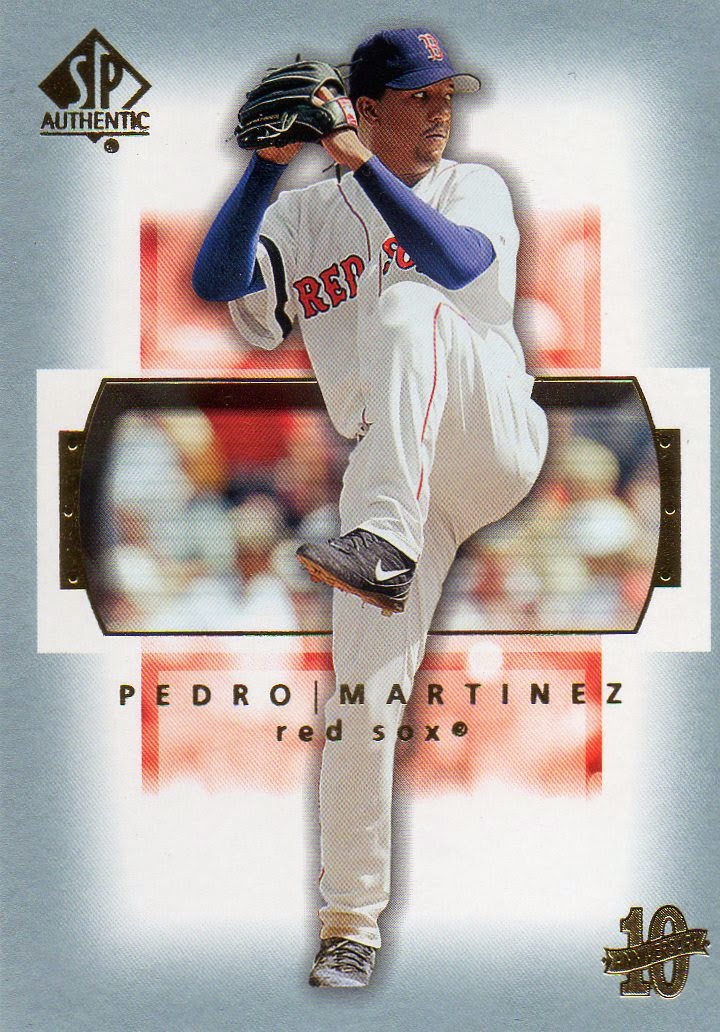
2003 SP Authentic
This card seems very “SP Authentic” to me. If you had to use
a card to explain what the brand is about, this would be a good one to choose.
Very deliberate, almost mechanical, designs. Lots of clean white (or, at least
light) space. If Apple had to design a card, it would design SP Authentic.
That doesn’t mean I have to like it.
Sure, I don’t NOT like it. There’s not much to dislike about
it. I’ll always prefer a full picture as opposed to the cut-outs. But, that’s
not going to be possible on every card. I get that. And, I appreciate how the
Authentic logo and the 10th Anniversary logo are hidden in the
corner. The 10th Anniversary one is especially pleasing. That’s the
sort of thing you could almost forgive them for plastering all over the card
every place they could. But, they held back. They were restrained. Which is in
keeping with the rest of the design.
I like the splash of color. The red stripe doesn’t seem to
have a reason or a purpose, but it makes the card feel a little less clinical.
The weird zoomed in rectangle serves the same purpose, while having the same
lack of reason. Color for the sake of color, I suppose.
I will always appreciate a player’s name written
horizontally. I will always not appreciate when it is placed in the middle of
the card, blocking some of the picture. I don’t really understand that.
I’m going to have to decide that I don’t like the card, but
I understand it. Companies need different brands to attract buyers. I can
certainly see how this could appeal to any number of people. I just don’t
happen to be one of them.
Are you?


No comments:
Post a Comment